Product and Design
Key takeaways
- Dark mode is a preference feature rather than a performance one, because on the LCD panels still shipping in budget phones and many laptops the colour change saves no power at all.
- Light mode outperforms dark mode on visual acuity and proofreading for most readers, and its advantage widens as font size shrinks, so a dark theme needs a larger base type scale.
- Readers with cataracts and other cloudy ocular media read faster in dark mode, which makes removing the option an accessibility decision rather than a styling one.
- Pure white text on pure black maximises halation for people with astigmatism, so soften the foreground to off-white and use a very dark grey background instead.
- Follow the operating system preference by default and offer a visible override, because which mode performs better flips with the task and the time of day.
What is dark mode, and what does it actually change?
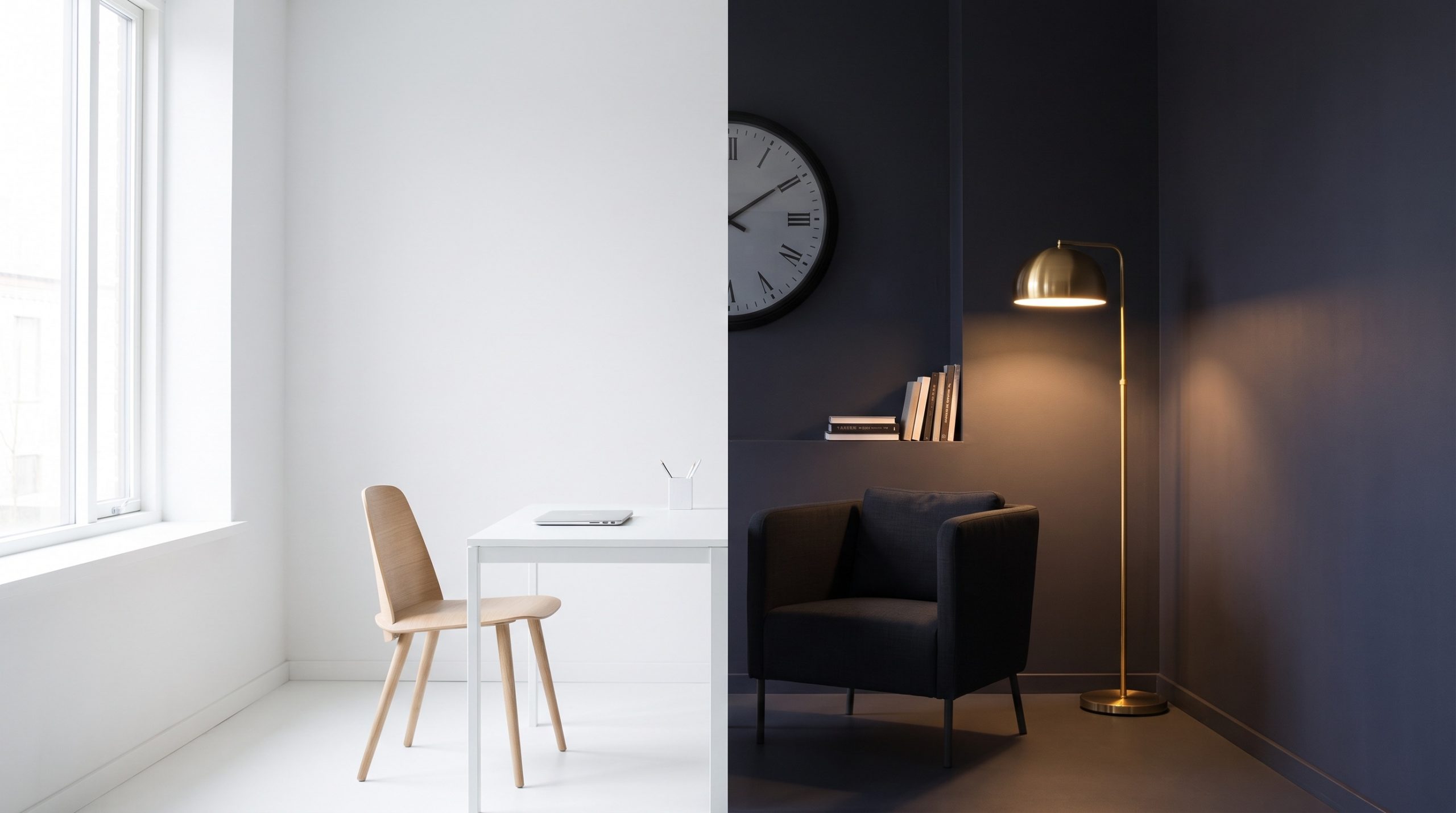
Dark mode is a user interface colour scheme that puts light text and elements on a dark background, the inverse of the dark-on-light arrangement most software still ships by default. Designers call the difference contrast polarity: positive polarity is dark text on a light background, negative polarity is light text on a dark one. Good dark mode UX starts by treating that switch as a typography and display decision rather than a performance feature.
Two claims carry most dark mode projects onto a roadmap. The first is that it saves battery. The second is that it is easier on the eyes. The measured evidence supports the first only under specific hardware and brightness conditions, and it complicates the second enough to change how the theme should be built.
Does dark mode save battery?
On OLED and AMOLED screens yes, though by less than the folklore suggests, and on LCD panels effectively not at all. Researchers at Purdue University measuring popular Android apps found that dark mode cuts 3% to 9% of total phone power in normal indoor use with auto-brightness enabled.1 Outdoors, with the screen at 100% brightness, the same switch saved 39% to 47%.1
The mechanism explains the spread. An OLED pixel makes its own light, so a black pixel draws close to nothing and a white one draws full power. An LCD lights the whole panel from behind whatever the pixels show, so a dark theme changes the picture and leaves the power draw alone. Budget phones and a large share of laptops still ship LCD panels, which means the battery argument does not apply evenly across an install base.
Vendor measurement points the same way. Google’s Android Power Lab recorded a 22% median battery reduction on Pixel devices at 60% brightness across two-hour scrolling tests, a figure that has circulated through secondary coverage rather than a published paper, so treat it as indicative.3
For a product team the reading is straightforward. Dark mode is a brightness story wearing a colour costume. If battery life is the business case, the larger wins sit in honest auto-brightness behaviour, fewer full-bleed white surfaces in high-traffic flows, and shorter time to task. Ship dark mode because users want it, and book the energy saving as a bonus that only part of the install base will collect.
Is dark mode better for reading?
For most readers, no. Nielsen Norman Group’s synthesis of the contrast-polarity literature reports that light mode outperforms dark mode on visual acuity and proofreading tasks across all dimensions, regardless of age, drawing on a 2013 study by Piepenbrock and colleagues.2 That is the finding most dark mode guidance leaves out, and it has direct consequences for type.
Two further results sharpen it. Light mode’s readability advantage grows as font size shrinks,2 so a dark theme built on the same type scale as its light counterpart gets quietly harder to read at caption, label and helper-text sizes. And in glanceable night-time reading tasks, light mode significantly outperformed dark mode, with no significant difference measured during the day.2
That second result undoes the most common assumption in this area. Popularity after dark is not the same as performance after dark, and it is a much weaker basis for forcing a theme on anyone.
Dark mode is not the night setting. It is a preference setting that happens to be popular at night.
The practical translation is a content map. Sort your surfaces by how long the eye stays on them. Long-form articles, documentation, spreadsheets, legal copy and anything typeset below body size sit on the side where light mode has the measured advantage, so those screens need the most care when the dark theme is on. Dashboards, media players, maps, camera views, notifications and settings panes are glanceable, mostly chrome, and lose little in dark mode. Teams that build the theme surface by surface in that order run out of budget in the right place.
Is dark mode an accessibility win?
For one group it clearly is. Nielsen Norman Group reports that users with cataracts and other cloudy ocular media read faster in dark mode than in light mode.2 For those readers the theme is not decoration. It is access, and removing the option removes reading speed.
The cost lands on a different group. Halation is the glow and blur that appears around bright text on a dark background, and it is most disruptive for people with astigmatism. Maximum contrast makes it worse, so pure white text on pure black is a design smell rather than an accessibility credential. Softening the foreground to an off-white or light grey shrinks the halo, and on a dark grey background there is usually enough headroom to do it and still clear the WCAG contrast minimum. Check the ratio rather than assuming it.
The honest conclusion is uncomfortable for both camps. Dark mode is not automatically accessible, and neither is light mode. Accessibility here means shipping both themes to the same standard, letting the reader choose, and auditing each theme against contrast ratios on its own rather than assuming the light-mode audit carries over.
How many people use dark mode?
Enough that its absence now reads as an omission rather than a decision. An aggregated usage-statistics report puts smartphone dark mode use at 81.9% and desktop or laptop use at 82.7%, with 92% of top App Store apps supporting the mode.4 Those figures come from an aggregator rather than a primary measurement study, so use them for direction and not as the business case.
The gap between those two student numbers is the more useful signal. Preference is strongest on a phone used in short bursts and weakest on a platform built for sustained reading, which is what the readability research predicts. Adoption is task-dependent, and so is the value of building the theme.
How do you build dark mode UX without breaking contrast?
A dark theme is not a colour inversion. Every token that carried meaning in light mode has to be re-derived, and six decisions cause most of the damage.
| Decision | Default that fails | Better default |
|---|---|---|
| Background | Pure black | A very dark grey near #121212, which reduces halation and leaves elevation somewhere to go |
| Body text | Pure white | Off-white or light grey, to soften the halo around bright glyphs |
| Type scale | Reuse the light-mode scale | A larger base size, and none of the hairline weights, because the readability gap widens as text shrinks |
| Elevation | Drop shadows | Lighter surface tints, since shadows all but vanish against a dark ground |
| Brand and accent colours | Identical hex in both themes | Lighter, less saturated variants, each retested for contrast on the dark surface |
| Imagery and charts | The same assets in both themes | Theme-aware assets, with white-background images and light chart plates handled explicitly |
Two engineering rules do the rest of the work. Respect the operating system signal, prefers-color-scheme, as the default and offer an in-product override, because the user has usually made this decision once already. Then treat the dark theme as a first-class QA surface. It doubles the visual review burden, and teams that skip that step ship unreadable disabled states, invisible focus rings and white flashes on navigation. We plan that cost in at the design system stage of a product development consulting engagement, because retrofitting a second theme onto hard-coded colours costs far more than shipping tokens built for two from the start.
The dark theme QA list most teams find out about late
These are the surfaces that pass review in light mode and fail in dark, in roughly the order they get reported by users:
- Disabled and placeholder text, which usually lands below the contrast floor once the background flips.
- Focus rings and selection highlights tuned for a white ground, which disappear on a dark one and take keyboard navigation with them.
- The white flash between page loads, caused by a theme applied after first paint rather than before it.
- User-generated and third-party content: pasted screenshots, logos on white plates, embedded videos, maps and syntax highlighting.
- Charts and data tables, where grid lines, zero lines and categorical palettes all need a second set of values.
- Print stylesheets and PDF exports, which should stay light whatever the screen is doing.
- Transactional email, which no theme toggle controls and which every mail client renders its own way.
When is dark mode UX worth the build?
Decide on the task, the hardware and the session, not the trend. Dark mode earns its place when the install base is OLED-heavy mobile, when sessions cluster in low light, when the content is glanceable rather than long-form, and when users have asked for it in research you actually ran. It slips down the list when the product is dense reading, small type, data tables and detailed documents, or when traffic is daytime desktop and the theme would exist mainly to look current.
Three positions are defensible: light-first with a good dark theme, dark-first with a good light theme, and system-following with a visible override. One is not, and it is the half-built dark theme that collapses on the settings screen, the print stylesheet and every third-party embed. A partial theme is worse than none, because it teaches users the mode is unreliable and sends them back to light mode with a lower opinion of the product.
If the demand surfaced in a workshop rather than in evidence, the fix sits a step earlier. Put the preference into structured discovery alongside everything else you test, which is what running the design thinking steps against a real user group is for. The theme then arrives as a decision with a reason attached, and with a metric to check it against.
Instrument the answer while you are at it. Record which theme each session resolves to, split by whether the user accepted the system setting or overrode it, and read that against completion rate and time on task for your heaviest reading screens. Two questions get settled by that one event: how many people genuinely want the dark theme on your product rather than on their phone in general, and whether the readability penalty the research predicts is showing up in your own numbers. Most teams argue about dark mode for a quarter and never collect the event that would end the argument.
Dark mode UX is a choice architecture problem rather than a taste one. Build both themes to the same standard, let the operating system speak first, keep the reader’s control visible, and size the type for the harder of the two. If the open question is what a second theme would cost across an existing product, our product development practice handles it as design system work, and you can bring a specific product to the team.
Frequently asked questions
Does dark mode actually save battery?
On OLED and AMOLED screens it does. Purdue University's measurements put the saving at 3% to 9% of total phone power in normal indoor use with auto-brightness, rising to 39% to 47% outdoors at full brightness. On LCD panels the backlight draws the same power whatever colour the pixels show, so the saving is close to zero. Lowering screen brightness saves considerably more than switching theme.
Is dark mode better for your eyes?
Not for most people, on the measured evidence. Nielsen Norman Group's review of contrast-polarity research finds that light mode outperforms dark mode on visual acuity and proofreading tasks regardless of age. The exception matters though: people with cataracts and other cloudy ocular media read faster in dark mode. Comfort and performance are different things, and preferring dark mode is legitimate even when it does not measure faster.
Should a website default to dark mode or light mode?
Follow the operating system preference by default, using prefers-color-scheme, and give the reader an in-product override. Forcing one theme overrides a choice the user has usually already made once. If a single theme has to be picked for a content-heavy site, light mode is the safer default, because its readability advantage grows as text gets smaller.
Why does text look blurry or glow in dark mode?
That effect is halation, a glow or blur around bright text on a dark background. It is most disruptive for people with astigmatism, and maximum contrast makes it worse. Pure white text on a pure black background is the usual cause. Use an off-white or light grey foreground on a very dark grey background, and raise the base font size slightly.
Is dark mode the right choice for night-time use?
Not automatically. In glanceable night-time reading tasks, Nielsen Norman Group reports that light mode significantly outperformed dark mode, with no significant difference measured during the day. Screen brightness is the lever that matters most after dark, for comfort and for battery alike, and Purdue's measurements show brightness changes dominating the colour scheme. A dark theme at full brightness is not a low-light setting.
Sources
- Purdue University, Elmore Family School of Electrical and Computer Engineering: Shedding light on dark mode to save energy, 2022. engineering.purdue.edu
- Nielsen Norman Group: Dark Mode vs. Light Mode, Which Is Better?, 2024. nngroup.com
- XDA Developers, reporting Google Android Power Lab measurements on Pixel devices, 2023. xda-developers.com
- Gitnux: Dark Mode Usage Statistics report, 2026. gitnux.org
- arXiv: An Exploration of Effects of Dark Mode on University Students, 2024. arxiv.org

Written by the group's editorial team with the practice leads who run these builds. Reviewed before publish. Spotted an error? Tell us and we will fix it.